Multiple Insights through tableau
Lets say what is data visualization?
Data can be visualized pictorial. ie pictorial view of the data through tableau software
Tableau offers multiple insights of the business. Lets ask tableau a different questions for the business.
Lets considers the retail store data where people are performing transactions and products are ordered and sold by category. This data is huge. Let analyse
First connect tableau to the excel file through navigation window and pul the tables to the canvas region of the data source page. tableau automatically assigns join conditions. If the changs have to be made in the grid view. Make changes for changing data type,custom split.
First row of the table is column header and it is broken down into dimensions and measures.
Lets summarize the questions which we should ask tableau in different ways.
1.What is overall trend of profit and sales of the retail stores.
2.Performance of different regions
3.Profitable and non profitable regions
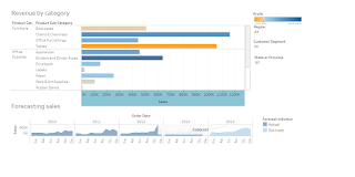
4. revenue by each category
5.forecasting of sales (predicting the future sales number by past data)
Overall trend, first questions we have to answer.
basically, the trend analysis (overall performance) put profit in rows and sales
when u showing trend select line representations . u can choose from show me options also.
Scatter plot is used for pair of numerical variable. That is , correlation.
e.g., Profit and sales
If the data is symmetrical take reference lines (mean,median)..how to make reference lines.
scatter plot identifies which region is profitable and which region is non profittable.
Now lets dive into pie chart for segment category
pie chart is used for profit and sales trend with respect to segment
filters can be used here for region and state.
Revenues by category can be found through line bar which sub category need to pay more attention and which region is less profit and which say easy to visualize.
Data can be visualized pictorial. ie pictorial view of the data through tableau software
Tableau offers multiple insights of the business. Lets ask tableau a different questions for the business.
Lets considers the retail store data where people are performing transactions and products are ordered and sold by category. This data is huge. Let analyse
First connect tableau to the excel file through navigation window and pul the tables to the canvas region of the data source page. tableau automatically assigns join conditions. If the changs have to be made in the grid view. Make changes for changing data type,custom split.
First row of the table is column header and it is broken down into dimensions and measures.
Lets summarize the questions which we should ask tableau in different ways.
1.What is overall trend of profit and sales of the retail stores.
2.Performance of different regions
3.Profitable and non profitable regions
4. revenue by each category
5.forecasting of sales (predicting the future sales number by past data)
Overall trend, first questions we have to answer.
basically, the trend analysis (overall performance) put profit in rows and sales
when u showing trend select line representations . u can choose from show me options also.
Scatter plot is used for pair of numerical variable. That is , correlation.
e.g., Profit and sales
If the data is symmetrical take reference lines (mean,median)..how to make reference lines.
scatter plot identifies which region is profitable and which region is non profittable.
Now lets dive into pie chart for segment category
pie chart is used for profit and sales trend with respect to segment
filters can be used here for region and state.
Revenues by category can be found through line bar which sub category need to pay more attention and which region is less profit and which say easy to visualize.

Comments
Post a Comment